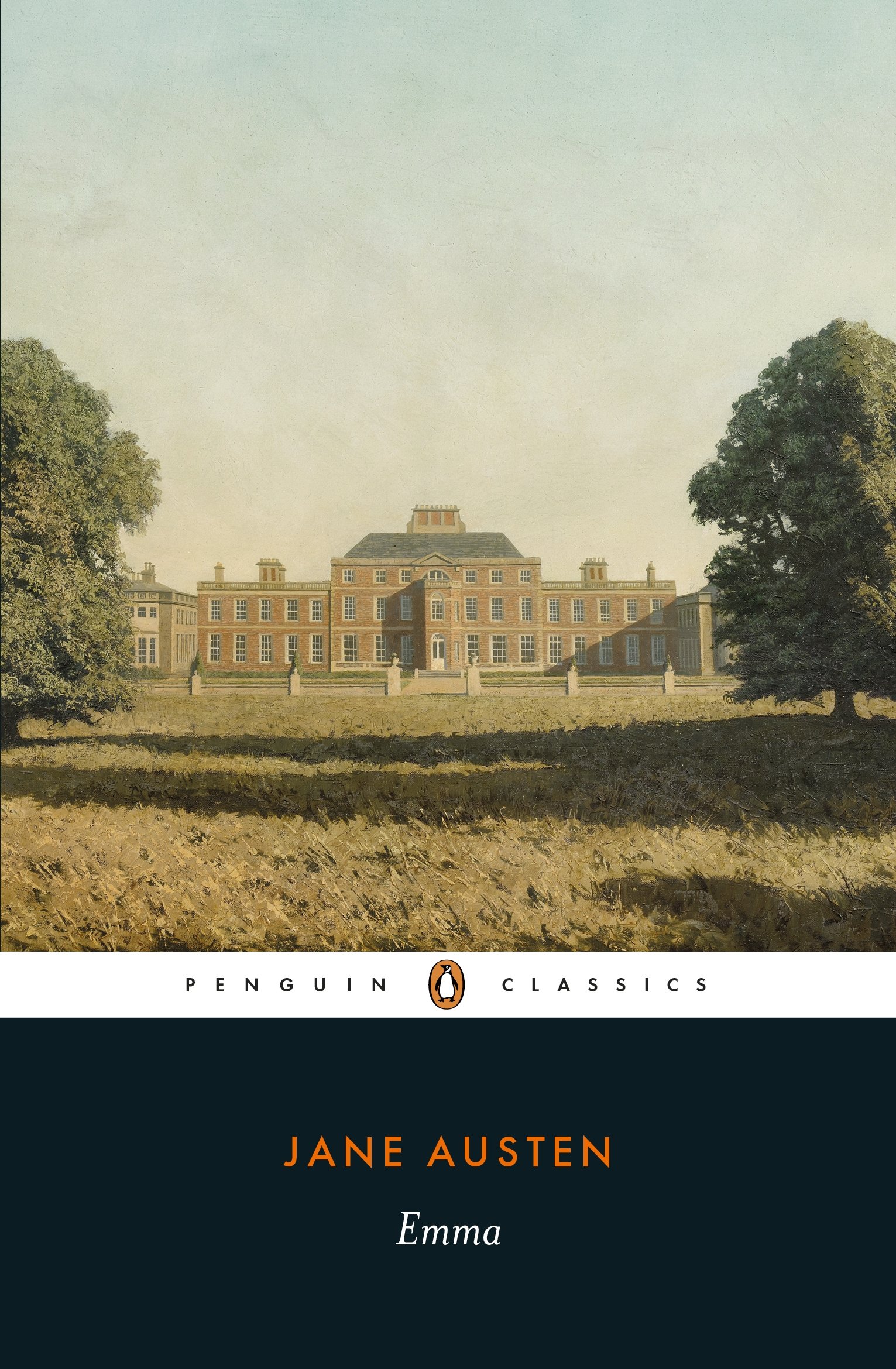
I love Jane Austen novels and one of my favorites (as with many others) is Pride and Prejudice. As a young girl, I remember reading it late into the night with a flashlight under the covers. While I missed many of the nuances of the story at that time, the romance itself was enthralling enough for me to read it over and over again. Later in life, I used this novel for several papers in various English classes. So, I guess you can say I am a big fan of the story.
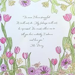
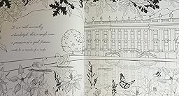
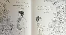
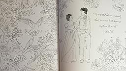
Sometimes that can and have made me very critical of takes on this novel. While I admit I am disappointed that there are not more designs which include Elizabeth and Darcy or other of the characters, I think the designs are quite lovely and will be lots of fun to color. Some of my favorite excerpts are included, including “It is universally acknowledged...” so the story is fun to read as I color. Just coloring my first choice of designs in the book made me reach for my Kindle to read the story in full once again.
The cover is in black print on white (with elements you can color) with gold foil highlights on the front. Both covers fold out and there are some elements on the flaps that can be colored but the inside of the covers are really just pretty patterns with nothing to color except background.
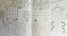
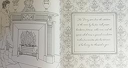
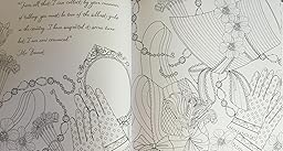
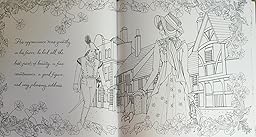
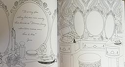
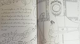
As I noted, there are lovely designs of gloves, flowers, and whatnot. The book is a little light on characters. The designs are intricate and detailed in spots but should not pose any particular issues in coloring apart from the fact the book is printed on both sides of the page.
This is what I found while coloring in this book and testing my coloring medium of the paper.
78 Storybook designs pages (including three pages of the language of flowers – lovely little addition to the book.)
Designs are printed on both sides of the page
Paper is heavyweight, white, slightly smooth, and non-perforated.
Sewn Binding which makes it easy to remove several pages at a time by snipping a few threads. This method makes sure you don't lose portions of the design if you want to remove pages.
Designs merge into the binding area.
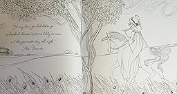
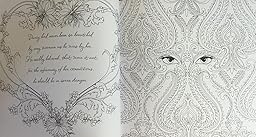
Some designs spread across two pages with essential elements merging into the binding area.
My copy of the book lined up very well on the two page designs.
I could get the book to lay fairly flat by breaking (or creasing) the spine.
Alcohol-based markers bleed through slightly on this paper.
Water based markers (except for brush end Tombows) left the slightest indistinct shadow on the back of the page. Tombow did not leave a shadow.
Gel pens and India ink pens did not bleed through this paper.
Colored pencils did well with this paper. I was able to color with light or heavy pigment, layer and blend using both my various wax and oil based pencils. I use a pencil style stick blender for my tests. Hard lead pencils did well and did not dent/score through to the back of the page.
No comments:
Post a Comment