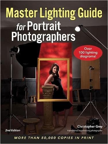
Christopher Grey's "Master Lighting Guide for Portrait Photographers" is a well-written, easy to follow guide that does an excellent job describing how to set up your lights to achieve different effects when shooting portraits. The photos that he uses provide superb examples of the effects of changing both the power of the light as well as how different modifiers affect the final image.
In this book, Mr. Grey begins with a quick lesson on the physics of light and basic lighting equipment. After that appetizer, he starts in with the real meat, discussing:
1. Lighting ratios and how to represent them in a universal language that is easy to translate to actual flash settings
2. Basic lighting, including broad lighting and short lighting
3. Classic lighting, where he gives specific details on how to arrange your lights to achieve several classic looks such as loop lighting, closed-loop lighting, Rembrandt style, side lighting, and butterfly lighting.
For each of these techniques, he presents lighting diagrams and sample "builds" to achieve the final product.
Following the overview of the specific lighting techniques, he discusses "Portrait Lighting in Practice", where he covers numerous topics including business photography (such as head shots), applying makeup, location photography, bridal potraits, high-key lighting, any many other topics. Whereas the previous portion of the book was written for a universal audience, this section is tailored slightly to the aspiring professional photographer. As an amateur with a minimal set of equipment that I set up in my living room, I was able to appreciate and understand everything he discussed in this area of the book, but there are definitely topics that I don't expect to need. I would imagine that these topics would be of more value to someone looking to become a professional.
I purchased the Kindle edition of this book for my iPad after reading my friend's copy of the physical book. The book presents nice, large, crisp photos that are extremely instructive. In the physical book, you can see the subtle differences that changing a light modifier or boosting the strobe a 1/2 stop has on the end photograph. In the Kindle edition, however, most of the photos are very small, grainy, and lose much of their value because they are so poor. Additionally, the layout of the Kindle edition is awful. For example, with the physical book, a page will show up to 8 different photos that allow you to compare the results of changes in light at a single glance. In the Kindle edition, however, there are at most 2 photos on a page, so not only can't you easily see the subtle differences in the photos all at once, but the text describing the differences is often 5 "pages" away. Finally, the Kindle edition conversion does not seem to be able to handle displaying fractions other than 1/2, as any time Mr. Grey uses a quarter-based fraction in his text (e.g. 1/4 or 3/4), all that you see in the Kindle edition is a square.
One would think that when converting a book about photography, whose value is as much tied to the actual photographs as the content, that there would be an emphasis on great photos in the Kindle edition. Sadly, this is not the case. I do not know if Amazon or Amherst Media (the book publisher) is to blame, but the quality of the Kindle edition is really unacceptable and if I could return it I would. Perhaps I should take some of the blame for not downloading a sample of the book first, but, please Amazon, improve your Kindle editions of these books.
No comments:
Post a Comment