Showing posts with label #IBRArtBooks. Show all posts

Thursday, May 3, 2018

Textile Collage: Using Collage Techniques in Textile Art Hardcover – October 4, 2016 by Mandy Pattullo (Batsford) #IBRArtBooks


Fabulous book--lovely texture on the outside makes me want to pet it! Awesome pictures and descriptions, a book to look at over and over again!

Collage and textile work come together in an inspired collection of techniques and projects! 

When designer Mandy Pattullo weds collage with textile work, the result is a happy marriage of techniques. Mandy shows how to transform those hoarded bits of fabric, trim, and memory-filled domestic textiles into something new and personal. From sourcing and unpicking found material to creating portraits with transferred images, and projects too, Textile Collage is a unique resource of creative ideas.

About the Author
Mandy Pattullo trained as a surface pattern and textile designer and now is a textile artist, exhibiting her own work around the UK and also running textile and printmaking workshops. Her work is based on collage technique, and she makes a conscious effort not to buy new fabric; instead, she repurposes the range of beautiful existing pieces that can be found everywhere.

Monday, March 5, 2018

Andy Warhol: Ladies and Gentlemen Text by Pier Paolo Pasolini. (SKARSTEDT GALLERY) (IBRArtBooks)


In 1975, Andy Warhol undertook a series of portraits of New York City transvestites, most of whom were recruited by Bob Colacello from a club called The Gilded Grape. The method for making these portraits followed Warhol’s customary formula: a Polaroid portrait of the sitter was silkscreened onto a canvas, which was then embellished with synthetic polymer paint in a bright array of red, pinks, yellows and pastels. Warhol’s transvestites are portrayed in a fairly classical fashion, neck-up, often at a three-quarter angle, and beckon at the viewer with a variety of expressions, from the plaintive to the coquettish to the triumphant. This beautifully produced monograph features 40 spot-varnished color reproductions of the Ladies and Gentlemen series, and reprints the Italian film-maker and poet Pier Paolo Pasolini’s fascinating and unusual take on Warhol and on the series.


"Is not the effort made by these 'Transvestites' to show themselves in a triumphant-looking mood suffused with wishful thinking and touching humanity? But beyond this effort they do not go. Naturally, the 'Different' in its permissive New York ghetto can triumph provided it does not go outside a behaviour by which it can be recognized and tolerated the feminine arrogance of these males is merely the grimace of the victim who wants to soften the slaughterer's heart with a clownish regal dignity. And it's this wry smile which makes the Transvestites all the same, like Byzantine dignitaries in a star-spangled apse."


Pier Paolo Pasolini, excerpted from Andy Warhol's Ladies and Gentlemen in Andy Warhol: Ladies and Gentlemen
.

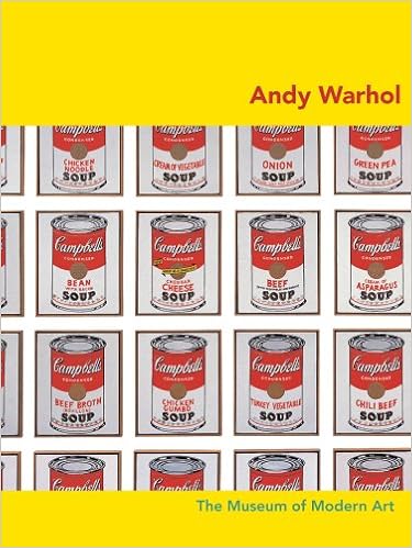
Andy Warhol By Carolyn Lanchner. (The Museum of Modern Art ) (IBRArtBooks)


Featuring artwork from The Museum of Modern Art’s unparalleled collection, each volume in the MoMA Artist Series guides readers through one artist’s most memorable achievements, explaining their significance and placing them in context among the groundbreaking innovations of their time. This series is an invaluable resource for exploring and interpreting some of the most beloved artworks by key artists who shaped the trajectory of modern art.


Through his art, ideas and style, Andy Warhol made an indelible mark on the history of modern art and on popular culture. This book features ten paintings by Warhol selected from The Museum of Modern Art’s collection of his work. His famous Gold Marilyn Monroe and Campbell’s Soup Cans are here, along with other equally groundbreaking and iconic silkscreen paintings—from his early work of 1961 to The Last Supper, a painting in progress at the time of his death, in 1987. An insightful essay by Carolyn Lanchner, a former curator of painting and sculpture at the Museum, accompanies each work, illuminating its significance and placing it in its historical moment in the development of modern art and in the artist's own life.

Access Moscow The Art Life of a City Revealed Edited by Kate Fowle, Ruth Addison. Introduction by Kate Fowle. Text by Valentin Diaconov, Andrei Kovalev, Sasha Obukhova, Elena Selina, et al. (Garage Museum of contempory Art ) (IBRArt Books)


In 1986 the Soviet government created a statute enabling citizens to form associations and clubs for the first time since the 1920s. This gave rise to the first official organizations created by unofficial artists, as well as the beginning of a vibrant gallery scene. Run by artists, curators and cultural entrepreneurs, these spaces unleashed the creative energy that now characterizes early post-Soviet Russia. Access Moscow examines the key role the first independent galleries played in the emergence of Moscow’s art scene in the 1990s. Through historical texts from leading practitioners of the time, as well as new essays, the book provides a first-hand account of an art community in formation, accompanied by a chronology of key events that defined the era and a gallery-by-gallery list of important exhibitions.

Mark Bradford: Tomorrow Is Another Day Hardcover – June 27, 2017 by Christopher Bedford (Author, Editor, Contributor),‎ Katy Siegel (Author, Editor),‎ Peter Hudson (Author),‎ Anita Hill (Author),‎ Sarah Lewis (Author),‎ Zadie Smith (Author),‎ James Baldwin (Author),‎ W.E.B. DuBois (Author),‎ Mark Bradford (Artist).(GREGORY R. MILLER & CO.) (IBRArtBooks)


America’s representative at the 2017 Venice Biennale, Bradford has radically renewed abstract art


Mark Bradford’s exhibition for the US Pavilion at the 2017 Venice Biennale, titled Tomorrow Is Another Day, is born out of the artist’s longtime commitment to the inherently social nature of the material world. For Bradford, abstraction is not opposed to content; it embodies it. Finding materials for his paintings in the hair salon, Home Depot and the streets of Los Angeles, Bradford renews the traditions of abstract painting, demonstrating that freedom from socially prescribed representation is profoundly meaningful in the hands of a black artist.


Mark Bradford: Tomorrow Is Another Day is not only a catalog for Bradford’s pavilion project; it is a different kind of book, a substantial publication that blends the biographical with the historical and political. Essays from outside the art world—by Anita Hill, Peter James Hudson, W.E.B. Du Bois and Zadie Smith—narrate a series of interwoven stories about Reconstruction, civil rights and the vulnerable body in urban space, fleshed out with vivid archival photographs and documents. The book also includes significant new texts from curator Katy Siegel and art historian Sarah Lewis, as well as a revealing interview with Bradford, offering a new understanding of the work of one of today’s most influential contemporary artists.


Mark Bradford was born in 1961 in Los Angeles, where he lives and works. Best known for his large-scale abstract paintings that examine the class-, race- and gender-based economies that structure urban society in the United States, Bradford’s richly layered and collaged canvases represent a connection to the social world through materials. Bradford uses fragments of found posters, billboards, newsprint and custom-printed paper to simultaneously engage with and advance the formal traditions of abstract painting.

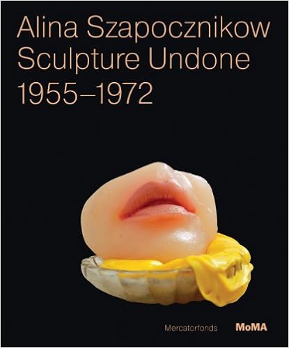
Alina Szapocznikow: Sculpture Undone, 1955-1972 Edited by Elena Filipovic, Joanna Mytkowska. Text by Cornelia Butler, Jola Gola, Allegra Pesenti. (THE MUSEUM OF MODERN ART, NEW YORK) ( IBRArtBooks)


A sculptor who began working during the postwar period in a classical figurative style, Alina Szapocznikow radically reconceptualized sculpture as an imprint not only of memory but of her own body. Though her career effectively spanned less than two decades (cut short by the artist’s premature death in 1973 at age 47), Szapocznikow left behind a legacy of provocative objects that evoke Surrealism, Nouveau Réalisme and Pop art. Her tinted polyester casts of body parts, often transformed into everyday objects like lamps or ashtrays; her poured polyurethane forms; and her elaborately constructed sculptures, which at times incorporated photographs, clothing or car parts, all remain as wonderfully idiosyncratic and culturally resonant today as when they were first made. Well-known in Poland, where her work has been highly influential since early in her career, Szapocznikow’s compelling oeuvre is ripe for art-historical reexamination. Alina Szapocznikow: Sculpture Undone, 1955–1972 offers a comprehensive overview of this important artist’s work at a moment when international interest is blossoming. Richly illustrated with over 150 color plates, the catalogue features essays that touch on key aspects of her practice and historical reception, as well as an extensive annotated chronology that provides an in-depth exploration of the intersection of her life and art. Working in one of the most rich and complex periods of the twentieth century, Szapocznikow responded to many of the ideological and artistic developments of her time through artwork that is at once fragmented and transformative, sensual and reflective, playfully realized and politically charged.
Alina Szapocznikow was born in Poland in 1926, and gained critical attention there for her early sculpture of the 1950s. She re-settled permanently in France in 1963, where her continued exploration of new materials such as polyester and polyurethane brought her into dialogue with the contemporary art scene of her time. She continued to push the boundaries of sculptural form and subject matter up until her premature death in 1973.


Malick Sidibé: Mali Twist Hardcover – November 28, 2017 by André Magnin (Author),‎ Brigitte Ollier (Author),‎ Manthia Diawara (Author),‎ Fondation Cartier Pour L'Art Contemporain / Editions Xavier Barral (IBRArtBooks)


“Sidibé captured the dynamism and joy of a rapidly changing West Africa ... they all got dressed for Malick.” –Vogue

Mali Twist offers an essential and immersive survey of the beloved African photographer Malick Sidibé—nicknamed “the eye of Bamako”—who chronicled the exuberant youth culture of his native Bamako, Mali, in the 1950s, ‘60s and ‘70s. The book is structured around his famous series: studio portraits in which young people pose alone or in groups, sometimes accompanied by quirky accessories; photographs of parties that radiate spontaneity and joy; and the comparatively lesser-known outdoor photography, depicting scenes at (for example) the edge of the Niger River, or at local swimming pools and villages. In addition to these iconic series, many previously unpublished photographs are gathered here, as well as archival documents. The series are punctuated by the authors’ texts, including testimony from friends of the photographer. With elegant paper changes and fabulous printing, this volume is a celebration of the postwar African vernacular.
Malick Sidibé (1935–2016) was born in Soloba, a small village in Mali. He opened the Malick Studio in 1962 in the heart of Bamako, subsequently becoming involved in the cultural and social life of the capital, and proving especially popular with young people, whom he depicted as they embraced new dances from Europe and Cuba and Western fashions. Sidibé won numerous awards including the Golden Lion for Lifetime Achievement in 2007 at the Venice Biennale and the PhotoEspaña Prize in 2009. He is represented by Jack Shaineman Gallery in New York and M+B Gallery Los Angeles. His work is in the collections of MoMA, the Metropolitan Museum of Art, NY, Getty Museum, Brooklyn Museum, SFMoMA, Baltimore Museum of Art, Birmingham Museum of Art, Alabama, Philadelphia Museum of Art and RISD Museum.


Featured image is reproduced from 'Malick Sidibé: Mali Twist.

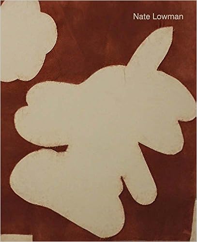
Nate Lowman Text by Saul Anton, Robert Hobbs, Jim Lewis, Heidi Zuckerman.(Aspen Art Press)(IBRArtBooks)


Taking humanity and popular culture as his subject matter, Nate Lowman (born 1979) approaches these themes as an active participant in the collective American experience. Underscoring this is desire: a longing for something or someone, or a wish for something to happen. The duality inherent in desire is contained in Lowman’s use of well-known images whose meanings are both instantly recognizable and constantly in flux. Appropriated, relatable images and language from American pop culture and its 24-hour news cycle form a narrative and tell part of the American story. Angels, poppies, hearts, pine-tree air fresheners, smiley faces, iconic celebrities, crosses and news articles—all presented through the lens of desire—confront viewers with the things of modern life that are often left unsaid and unexamined.

For more than a decade, Nate Lowman has produced paintings, sculptures, and (often salon-style) installations that process and represent the unfolding human experience in a visual environment of endlessly proliferating public media archives. Re-presenting and reframing techniques of image reproduction as painterly practice, Lowman constructs narratives condensed in layers of studio techniques, including printing, cropping, projecting, cutting, staining, repurposing, lacquering, stripping and stretching. His paintings explore the capacity of images to mediate between the personal and the universal in cycles of decay and renewal.

Published on the occasion of the Aspen Art Museum’s exhibition of the New York–based artist, Nate Lowman features texts by writers Saul Anton, Robert Hobbs and Jim Lewis, and museum director Heidi Zuckerman, and is the first comprehensive monograph on the artist to date.


Jasper John Flags and More Flags ....Jasper Johns: Catalogue Raisonné of Painting and Sculpture edited by Roberta Bernstein with Heidi Colsman-Freyberger, Caitlin Sweeney, and Betsy Stepina Zinn.The Wildenstein Plattner Institute/Yale University Press, five volumes, 1,578 pp., $1,500.00 Jasper Johns: Redo an Eye by Roberta Bernstein The Wildenstein Plattner Institute/Yale University Press, 335 pp., $60.00 Jasper Johns: “Something Resembling Truth” an exhibition at the Royal Academy of Arts, London, September 23–December 10, 2017; and the Broad, Los Angeles, February 10–May 13, 2018 Catalog of the exhibition edited by Roberta Bernstein Royal Academy of Arts/ The Broad, 262 pp., $65.00 Jasper Johns: Pictures within Pictures, 1980–2015 by Fiona Donovan Thames and Hudson, 288 pp., $60.00(IBRArtBooks)

Image result for Jasper John Flags


A good mythology needs a Genesis story. For Jasper Johns, the dawn of creation came in the late fall of 1954, and was instigated not by divine revelation but something close to it: a vision in a dream. A year out of the army, asleep in a loft in lower Manhattan, Johns closed his eyes and saw the Stars and Stripes in the dark, not fluttering, not flying over a battlefield, but on an easel—and he was there, too, painting it. It’s hard enough to remember a dream the next morning, let alone decades on, and Johns recounted his vision of himself painting a flag with slight variations in the decades that followed: he may or may not have told Robert Rauschenberg about it over breakfast. But the next day he was at work, and by the spring of 1955, he had completed the painting he had seen in his vision.

Flag now hangs in the Museum of Modern Art, and it is painting no. 5 in the enormous new catalogue raisonné of Jasper Johns, a five-volume monument to the most inscrutable figure in modern American art. The painting is five feet wide and three-and-a-half feet tall. A canvas of that size would have been too expensive for the young artist, so he took a bedsheet and stretched it across three wooden supports, one for the spangled canton, two for the stripes. He then applied layer after layer of enamel paint, but it took forever to dry, so he picked up a package of beeswax at a store around the corner from his Financial District loft. Melting the wax on his hot plate, stirring in oil paint and varnish, he produced a fast-drying encaustic that would yield a textured surface and would embalm collaged clippings from The New York Times and New YorkDaily News, a rag found on the street, and even a certificate of American citizenship. The stars, their points somewhat raggedy, cohered through the collaging of wax-dipped fragments, white or blue, along carefully penciled outlines.

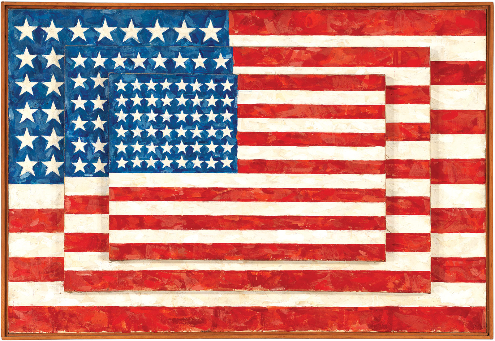
Johns would go on to paint or draw more than three dozen flags. White Flag, painted in the summer of 1955 and now in the collection of the Metropolitan Museum of Art, is larger, ten feet by six and a half, and the flag pattern remains perceptible beneath its whited-out surface thanks to the collaged papers and a subtle use of charcoal. Gray Flag, from 1957, is even closer to a monochrome. There were double flags and triple flags, flags with forty-eight stars and flags with fifty, flags made from encaustic and oil paint and pastel and in one case Sculp-Metal, a medium for hobbyists that, as the ads went, “models like clay—hardens into metal!” One flag, drawn in ashy graphite, has sixty-four stars: an error Johns didn’t catch until he’d finished the drawing, and decided not to correct.


Rachel Rosenthal/Rachel Rosenthal Lifetime Trust
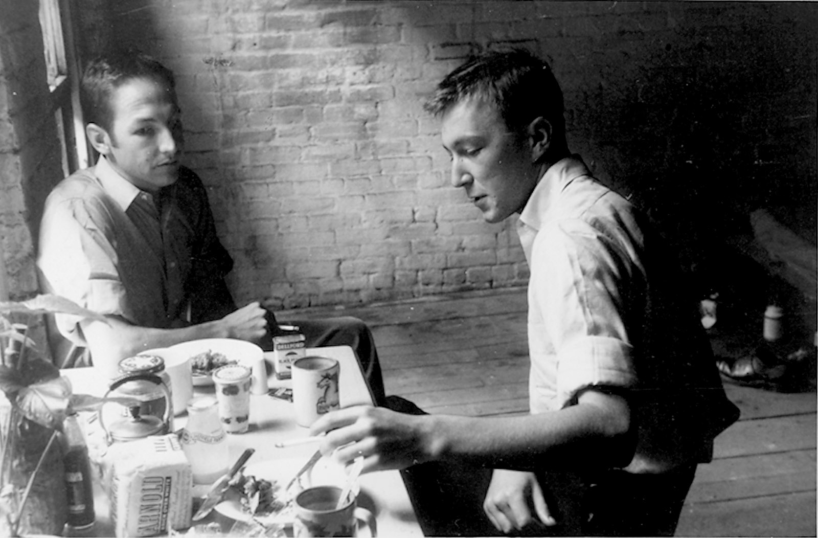
Robert Rauschenberg and Jasper Johns, Pearl Street, New York, 1954; photograph by Rachel Rosenthal


The painted flags are all accounted for in the Johns catalogue raisonné, which comprises three volumes of documentation of his paintings and sculptures; a one-volume bibliography; and a monograph by the art historian Roberta Bernstein, also available as a single book under the title Jasper Johns: Redo an Eye. (Johns’s complex, often extraordinary prints are omitted; a catalogue raisonné of those was published in 1994, and a new one of Johns’s monotypes was published last year. A multi-volume catalogue raisonné of his drawings is in the works.) Six of the flags were also on view this fall at the Royal Academy in London, where Bernstein and the curator Edith Devaney organized “Jasper Johns: ‘Something Resembling Truth,’” a stately recapitulation of sixty years of Johns’s sphinxlike signs and symbols. One of the flag paintings on view, a fifty-starred beauty from 1967, belongs to Eli and Edythe Broad; the show is now on view, in an expanded form, at their private museum in Los Angeles. An even more substantial showcase is in the works: the Whitney Museum of American Art in New York and the Philadelphia Museum of Art will present an unprecedented two-part retrospective of Johns’s entire career in 2020.

I saw “Something Resembling Truth” in London this past October, and, especially abroad, the flags were hard to take. Johns’s ambivalent American paintings, equipoised between image and object, invention and preexistence, have long confounded art historians and critics—unsure of whether they stand for the United States and what sort of political orientation Johns imagined for them. (Only once, for a 1969 poster for the Moratorium Committee to End the War in Vietnam, did Johns produce a flag with a clear partisan aim. It had green and black stripes and an orange canton.) It has also become a commonplace, in the sixty years since Johns painted the first Flag, for critics to bewail how much wider the gap has grown between the ideals of America and the country’s brutal realities. But no critic until this past year has had to contend with Johns’s flags when the very survival of the American republic was in doubt, and when America’s economic power, cultural influence, and geopolitical clout were so clearly in decline. The mythology of Jasper Johns, after all, has always been predicated on the primacy of American art as the postwar successor to European modernism—and critics will have to reckon anew with postwar American art if American primacy becomes a thing of the past.

How much has changed, politically, historically, aesthetically, since Johns’s dream? And how best to come to grips with him? The Royal Academy show proposed a thematic study, opening with a remarkable trio of paintings—a Target from 1961, the crosshatched Within from 1983, and the barren, agglutinative interior scene Racing Thoughts, from the same year—and then presented about 150 works grouped by themes of time, objects, the seasons, and memory. I suspect, however, that the just-the-facts style of a catalogue raisonné—what was painted, in what order, out of what materials; where was it shown, by whom was it acquired, and where is it now—actually offers a better introduction to his poker-faced art. Johns has been a favorite subject of philosophers of aesthetics, psychoanalytically engaged critics, and queer theorists with a detective streak, but his art resists disentanglement, and his signs and symbols never fully reflect any biographical source or intellectual underpinning. (“I don’t know how to have thoughts,” he told The Guardian in 2004.) Even Johns’s disclosure of the dream of Flag offers just the barest of revelations. The painting may have sprung from his deepest unconscious, but what does that reveal, other than that even he cannot say what it means?

Johns was born in 1930 in Augusta, Georgia; he had a difficult childhood. His parents divorced when he was two, and he grew up among an extended family in segregated South Carolina. At twelve, months after the attack on Pearl Harbor, he won a statewide scrap metal drive, the prize for which was a new American flag for his school.

As a child he had little exposure to art, but he drew incessantly, and before he was out of his teens his teachers encouraged him to go to New York, where he enrolled at Parsons, then dropped out, did odd jobs, and barely got by. He saw the art of Jackson Pollock, Barnett Newman, and the other Abstract Expressionists before being drafted in 1951. He served for two years, though never in Korea; most of his service took place back in South Carolina, at Fort Jackson, where he trained in heavy artillery and organized art exhibitions on the base, including of his own (now destroyed) work.

Back in New York, he worked nights as a clerk in a bookstore that specialized in art publications, and he saw countless exhibitions, as well as performances by the Merce Cunningham Dance Company. The leading galleries were still dominated by Abstract Expressionism. In Willem de Kooning’s garish squiggles, Newman’s abstemious zips, and the last of Pollock’s trickles, advanced American painting took the form of confident, gestural nonobjectivity. Johns has often been misread as the gravedigger of Abstract Expressionism, and he and Rauschenberg were frequently called “neo-Dadaists,” a misnomer that stemmed from their interest in everyday objects and a dissolution of the distinction between art and life. In fact, Johns had an only cursory knowledge of Dada in the early 1950s, and would not meet Marcel Duchamp until the end of the decade. He was, however, a keen student of de Kooning, Newman, and particularly Jack Tworkov, whose brushy gestures were more contained and reserved than de Kooning’s and Pollock’s blasts. Yet Johns found that he couldn’t perform Abstract Expressionism’s emotional theatrics; he was too reserved for that. “I didn’t want my work to be an exposure of my feelings,” he explained in 1973. A work of art, for the young Johns, had to have meaning and importance independent of the artist’s personality.

A flag is two-dimensional, abstract in most cases, and, unless you are Nepalese, rectangular. But had it not been for the Ab-Exers’ practice of decentralizing compositional elements into an all-over pattern, Johns might never have dreamed—literally and metaphorically—of depicting the Stars and Stripes across the entirety of the picture plane, such that Flag, as the art historian Fred Orton has written, “both represents its subject and is the subject represented.” The breakthrough of the flag, in other words, was not that it depicted a preexisting object as if it were an abstraction. Rather, it vitiated the whole distinction between pictures and objects; the symbol and the materials that constituted it were one and the same. In the catalogue raisonné Bernstein cunningly refers to this first painting as both Flag and “the flag,” in lowercase and without italics, as if to reaffirm its hybrid status. The same equivocal position would hold with Johns’s subsequent targets and maps, all of which, as she writes, “seemed to blatantly renounce the viability of the dominant abstract mode.”

“Things the mind already knows,” as the artist called them, were Johns’s escape routes from the dead end of gestural abstraction, and in the late 1950s and early 1960s he would rely on familiar symbols or everyday objects to dismantle expectations of unitary meaning, and personal expressivity too. The digits 0 through 9, painted in encaustic or stenciled in sequential grids, take on abstract form even as they still express numerical values, though in a few paintings, such as 0 Through 9 (1960), the ten digits are overlaid upon one another, their curves and straight edges just barely intelligible amid red, orange, and light-blue stains.

He also turned to sculpture, casting bronze lightbulbs and flashlights, or molding cans of beer or his own brushes in a coffee can, then painting the surfaces to create uncanny replicas. Like the flags and targets, these were not straight readymades in the manner of Marcel Duchamp’s bicycle wheel, bottle rack, or urinal, which Johns saw for the first time around 1958; they were, instead, sculptures that took the form of preexisting objects. Johns’s anti-illusionism also led him to treat paintings as objects in themselves, either by attaching rulers and dragging them across the surface, or by splitting a composition across multiple canvases and emphasizing the spaces between them. Objects in the real world became art (but works of art remained objects) through a sequence of undefined procedures, as expressed in Johns’s most mythologized formulation: “Take an object. Do something to it. Do something else to it.”

One part of Johns’s career that was not mythologized until recently was his relationship with Robert Rauschenberg—his collaborator, his studio mate, his first great critic, and his lover, though even today museums and books are sometimes loath to say so. Rauschenberg was nearly five years older, divorced, with a son. When they met he’d already shown at Betty Parsons Gallery, and he had befriended Cunningham and John Cage during his second stint at Black Mountain College in North Carolina, which he attended with his first male lover, Cy Twombly. Johns was cerebral, taciturn. Rauschenberg never stopped talking.

The wall text at the Royal Academy primly disclosed that Johns and Rauschenberg “traded ideas and saw each other every day.” Yet the love and cooperation of Rauschenberg, as much as anything, catalyzed Johns’s whole career. In 1954, Rauschenberg was already somewhat established; Johns was not, and his decision to destroy or disclaim everything he’d made beforehand can’t be divorced from his intellectual and emotional intertwining with a man also committed to treating paintings as objects. The first painting in the catalogue raisonné—that is to say, the earliest surviving work Johns claims as his own—is a very Rauschenbergian combine, in which a plaster death mask sits nestled in a box beneath a yellowed newspaper collage.


Whitney Museum of American Art/© Jasper Johns/Licensed by VAGA, New York
Jasper Johns: Three Flags, 1958

This was fifteen years before Stonewall. To be out was a dangerous thing, and even gossip could ruin you. And yet amid this stifling atmosphere Johns and his lover emerged as the most important artists of the decade, the successors to egoistic Abstract Expressionists whose violent spills and gashes read as performances of extreme masculinity. By 1965, readers of Esquire were offered the caustic assessment of the critic Harold Rosenberg that “a feature of the past four or five years has been the banding together of homosexual painters and their nonpainting auxiliaries in music, writing and museum work.”

Johns has never enjoyed making public disclosures, in his paintings or in the press, and he has at times bridled when critics have focused on his sexuality. (When Jill Johnston, the Village Voice dance critic and one of America’s first out gay journalists, published her psychosexual biography Jasper Johns: Privileged Information in 1996, he denied her requests to reproduce his work.) His discretion has at times led scholars to treat homosexuality as a skeleton key that unlocks each of his hermetic puzzles. But not every hinge attaches to a closet door, and sometimes a target’s bull’s-eye is just a bull’s-eye.

Surely there’s a third way between overreliance on biography and the downright closeting that still sometimes attends Johns, as seen in “Dancing Around the Bride,” a Duchamp-themed exhibition at the Philadelphia Museum of Art in 2012, which barely disclosed that Johns, Rauschenberg, Cunningham, and Cage were not just four gay men but two couples. Robert Storr, in a pleasantly hyperbolic essay in the Royal Academy/Broad catalog, reckons with Johns’s sexuality while acknowledging that one can be reserved without being unsexed. After all, as Storr writes, “Johns’s works include some of the most explicit depictions of male genitalia in contemporary American art.” A flaccid green penis appears within one of the hinged boxes of Target with Plaster Casts (1955), which forced Alfred Barr to pass on acquiring it for MoMA. The crosshatched Tantric Detail III (1981), displayed at the Royal Academy, features both a partial skull and a cartoonishly symmetrical scrotum, centered on the painting’s vertical axis and stippled with short black and white hairs. (A related drawing is now at the Broad.) That theme is evoked more metaphorically in the naughty Painting with Two Balls (1960), in which an all-over, nearly Abstract Expressionist surface of warm-colored camouflage gets gashed apart, the slit held open by a pair of wooden spheres.

“He may be among the most solitary, and often saturnine, artists alive,” Storr writes. Yet even this least forthcoming of artists could not restrain his emotions in 1961 when he and Rauschenberg broke up. That December Johns exhibited four paintings at Leo Castelli Gallery, on a single wall. They were all gray monochromes, one of them stenciled with the word LIAR, another affixed with two lead letters that spelled NO. The largest, just about the same size as the 1954–1955 Flag, was In Memory of My Feelings—Frank O’Hara, comprising two canvas panels joined by hinges (a Duchamp quotation), their surfaces masked by mournful, dripping splashes of gray. “My quietness has a man in it,” begins O’Hara’s poem, its title stenciled at the bottom of the composition. Three quarters of the painting include visible brushstrokes, but one quarter, the top-left canton, is scrubbed almost clean. It is a flag, obliterated.

In one of his very first interviews, Johns proposed that “looking at a painting should not require a special kind of focus like going to church. A picture ought to be looked at the same way you look at a radiator.” A painting, both as a picture and as an object, should be comprehensible in itself, and any further explication was just critical onanism—a point he underlined with his obnoxious sculpture The Critic Sees (1961), a brick embedded with eyeglasses behind which we discover not scrutinizing eyes but jabbering mouths. Yet even by 1961, with In Memory of My Feelings (on view at the Broad; the Royal Academy made do with a study), Johns was embedding within his compositions literary references, symbolic riddles (a fork and a spoon nuzzled into each other), citations of his own earlier works, and discreet personal disclosures. The flags continued into the 1960s; the numbers have ticked along into this millennium. But as both the catalogue raisonné and “Something Resembling Truth” confirmed, by the 1960s Johns’s painting, sculpture, and printmaking had shifted into another key, and its principal concern was no longer art’s ontological status (what is it?) but its elaboration through symbols and within history (what does it mean?).

The crosshatched paintings of the 1970s are fugues played on the ruins of modernism, their homogenous scores and nicks repeating and shifting across the canvas, and often obscuring designs beneath. Bernstein notes that the crosshatchings are the first Johns paintings that can be properly called abstract, though they are more like drawings than the gestural abstractions of Pollock or Tworkov, and they bristle with citations from Matisse, Picasso, the Surrealists, and other early-twentieth-century figures. Later he found a surprising resonance in an artist he loved: Edvard Munch, whose late Self-Portrait Between the Clock and the Bed includes a bedspread articulated through abstract hatches of red and black. A suite of paintings titled Between the Clock and the Bed begun in 1981 (two of which were in the Royal Academy) retains the all-over crosshatching of the 1970s works, but the thin parallel lines, picked out with haloes of ghostly white, are cast in a more anxious, Nordic register.

Mortality was not a new theme for Johns—In Memory of My Feelings was initially titled A Dead Man, and Arrive/Depart (1963–1964) includes an imprint of a skull. Munch, however, seems to have led Johns to a new engagement with death, one that deepened amid the first awful years of the AIDS epidemic. Strictly representational elements start to appear in the 1980s, first in the skulls and scrota of the Tantric Details, and then in newly representational tableaux that incorporated Surrealist symbolism and spatial organization, as well as source materials or quotations from his earlier work painted as trompe-l’oeil clippings or posters. Racing Thoughts (1983), which opened the Royal Academy show but is absent from the Broad, is a prime example: it features a jigsaw puzzle of Leo Castelli, a lithograph by Barnett Newman, a cheap poster of the Mona Lisa (Duchamp again), a vase by the “mad potter” George Ohr, and a skull and crossbones from a Swiss poster warning of avalanches—all of which are integrated into a half-representational, half-abstract composition tied together with an obscure outline of a detail from Matthias Grünewald’s Isenheim Altarpiece.

Hard to interpret, fiendish to translate into words, these later paintings present an introverted formality that makes them tough to love. The art historian Fiona Donovan, in her new book, Jasper Johns: Pictures within Pictures, 1980–2015, makes a valiant effort to elevate the last three decades of Johns’s career, which she presents in humanistic terms far removed from the ontological games he played in the 1950s and 1960s. “His art of the 1980s and 1990s,” she writes, “has a dignified, timeless, interior character that suggests a corrective to the political moralizing and self-exposure rampant in the United States at that time.” Possibly so. But I don’t think the problem with late Johns is his froideur so much as the bluntness of his citations, whether in googly eyes borrowed from Picasso or in his own flags and coffee cans, and their easy equation to an interiority Johns doesn’t really divulge.

The best of Johns’s later works are his Catenary paintings, begun in 1997, in which strings hang in front of principally gray compositions framed with trompe-l’oeil wood and enlivened with astronomical imagery; the catenaries, suspended from two points and shaped by gravity, continue a Duchampian concern with measurement that harkens to Johns’s ruler-scraped canvases of the early 1960s. Too often, though, his recent art falls into pastiche, and occasions only an undemanding hunt for the greatest hits of his back catalog. The newest work in “Something Resembling Truth,” an untitled blue composition from 2016, has a painted ruler rather than a real one; the astronomical clippings from the Catenaries are back; and the Picasso googly eyes have been rounded and simplified so that they look like zeros. Johns’s tropes have themselves become, this late in the game, “things the mind already knows.” And yet still there is invention, as in his cheerless, Apollonian series Regrets, begun in 2012, which transmutes an old photograph of Lucian Freud into slabs of black and hidden skulls.

In 2008, on the occasion of his all-gray retrospective at the Metropolitan Museum of Art, Johns told The New York Times that “artists today know more. They are aware of the market more than they once were. There seems to be something in the air that art is commerce itself.” And he was right. Young artists, thrust into an art world richer than ever (and a New York where studios, indeed where studio apartments, are now largely out of reach), have had no choice but to get smart about the economics of art. The result has been that any remaining formalist commitment to the autonomy of painting or sculpture is now well and truly dead; these days, the white cube offers no escape from the world outside.

Johns was himself one of the undertakers of an autonomous sphere of art, so central to the development of modernism. He invited you to salute his flags or shoot arrows at his targets when most of New York still defended art for art’s sake. Art’s use value and exchange value were also on his mind when he made his painted sculptures of beer cans, after de Kooning snapped, apropos Castelli, that “you could give that son-of-a-bitch two beer cans and he could sell them.” But there are relative degrees of autonomy and contingency, and as Johns himself admits, the artists that have followed him work amid commercial conditions he never had to face. To anyone under forty, the autonomy he disclaimed looks more and more like a lost privilege, a luxury we would give anything to regain.

Is it a painting or is it a flag? The question sounds practically quaint sixty years on—when art is encountered more and more on touchscreens and in social feeds, and when the market and other art institutions have more power than any philosopher to answer that question. Johns found a way to make a painting both a picture and an object. Today every single painting has that double role, and must function, as the art historian David Joselit has argued, as “a dynamic form that arises out of circulation.” It was that, more than any heartsickness for lost American ideals, that hit me hardest when I stared down Johns’s painting of a fifty-starred flag in London, and then peeked at the label to see which billionaire owned it. Anything in an art gallery is an object, an image, but an asset above all—those are things the mind already knows.

Bruce Nauman: Disappearing Acts Edited by Kathy Halbreich, Isabel Friedli, Heidi Naef, Magnus Schaefer, Taylor Walsh. Text by Thomas Beard, Briony Fer, Nicolás Guagnini, Kathy Halbreich, Rachel Harrison, Ute Holl, Suzanne Hudson, Julia Keller, Liz Kotz, Ralph Lemon, Glenn Ligon, Catherine Lord, Roxana Marcoci,Magnus Schaefer, Felicity Scott, Martina Venanzoni, Taylor Walsh, Jeffrey WeissTHE MUSEUM OF MODERN ART)(IBRArtBooks)


With a magician’s sleight of hand, Nauman’s art makes disappearance visible

At 76 years old, Bruce Nauman is widely acknowledged as a central figure in contemporary art whose stringent questioning of values such as good and bad remains urgent today. Throughout his 50-year career, he has explored how mutable experiences of time, space, sound, movement and language provide an insecure foundation for our understanding of our place in the world.

This richly illustrated catalog offers a comprehensive view of Nauman’s work in all mediums, spanning drawings across the decades; early fiberglass sculptures; sound environments; architecturally scaled, participatory constructions; rhythmically blinking neons; and the most recent 3D video that harks back to one of his earliest performances. A wide range of authors—curators, artists and historians of art, architecture and film—focus on topics that have been largely neglected, such as the architectural models that posit real or imaginary sites as models for ethical inquiry and mechanisms of control. An introductory essay explores Nauman’s many acts of disappearance, withdrawal and deflection as central formal and intellectual concerns. The 18 other contributions discuss individual objects or themes that persist throughout the artist’s career, including the first extensive essay on Nauman as a photographer and the first detailed treatment on the role of color in his work. A narrative exhibition history traces his reception, and features a number of rare or previously unpublished images.


Bruce Nauman was born in Indiana in 1941 and raised near Milwaukee, Wisconsin. He studied math, music and physics at the University of Wisconsin–Madison before switching his major to visual art, and received an MA in sculpture from the University of California, Davis, in 1966. In 1979 he moved to New Mexico, where he continues to reside. Nauman’s work has been the subject of two previous retrospectives, in 1972 and 1994. In 2009 he represented the United States at the Venice Biennale, where he won the Golden Lion.

I Caravaggeschi Percorsi e protagonisti Editors: Alessandro Zuccari Collection: Arte antica Publisher: Skira Category: Special offers, Ancient Art, Language: Italian Year: 2010 Isbn: 888491282 Dimensions: 24 x 28 cm Pages: 864 Colour illustrations: 700 Volumes: 2 (IBRArtBooks)

book


The most complete publication to date on the complex story of the Caravaggesque style.

Michelangelo Merisi da Caravaggio (1571-1610) is probably the most admired, studied and universally known painter of 17th century Italy. Every knows the legend of this cursed and hot-tempered painter, who was rejected by the Roman Curia for his paintings, which were considered to be inappropriate and even scandalous. However, a more complete picture of this artist – as the skilful director of a career fostered and protected by influential cardinals and important nobles families – has been known for some time now, in all its complexity. Although many questions still remain regarding Caravaggio’s body of work, it is certain that he never formed a proper school or studio. Caravaggio did however have a substantial circle of followers throughout Europe, an unofficial school formed by those who knew him personally and were in direct contact with his works, and also by those who discovered his work following his death.

• Published on the occasion of the 400th anniversary of Caravaggio death, this much-anticipated opus examines the work of the artists considered to be direct followers of Caravaggio, such as Bartolomeo Manfredi. It also takes into account the other painters who supported the Caravaggesque movement in the first decades of the seventeenth-century. It also explores artists who assimilated certain aspects of the style as well as numerous foreign Caravaggesque artists from France through to Flanders and Spain.
• Important technical details and updated bibliographical information are included for all the paintings in the book.
• A landmark of Western art history, and an ‘opera’ in size price, and scope: the most complete publication to date on the complex story of the Caravaggesque style, the backbone of the Baroque era: it will appeal to historians, critics, collectors, antique dealers, and anyone interested in classic art.

Alessandro Zuccari, professor of History of Modern Art at Università La Sapienza, Roma, is curator and essayist

Bruce Nauman: Live or Die Collector's Choice Vol. 10 Text by Eugen Blume. (DUMONT BUCHVERLAG) (IBRArtBooks)


Some forty-odd years after Bruce Nauman began tweaking the conventions of studio practice and the hallowed persona of the 'artist-as-seer,' Pamela M. Lee wrote in Artforum not long ago, "his station in postwar art history rests secure. His influence--whether through his affectless, task-based performances, his sculptural castings of negative space, or his intermedia mash-ups of language, video and noise--is everywhere apparent in contemporary art." Indeed, from the American artist's early work in sculpture and video, made in the 1960s, through his famous spiral of neon letters spelling out "the true artist helps the world by revealing mystic truths," which at once summarized and opened to critique the perennial mystique of the artist, up through his three-venue Golden Lion Award-winning exhibition at the 2009 Venice Biennale, Nauman's work has long been an indispensable part of the narrative of recent American art. This essential volume, published in DuMont's fantastic Collector's Choice series, treats these and other recurrent themes of his oeuvre, such as sound, language, corporeality and dance, reproducing works from across his career and and providing a new standard overview of this ever-popular artist.

FROM THE BOOK"It its materialistic inversion the metaphysical certainty of 'die and become' is--and quite unequivocally so--nothing but biological passing. It is towards this atheist materialism that Bruce Nauman directs his doubts and his questions. Although his thinking is by no means intentionally metaphysical, these existential boundaries nevertheless mark the point of departure for his measuring of being. The fact that for Nauman the mystical relates to truth, and the two of them in turn to art, was articulated by the artist early on in a tone entirely devoid of derision, if to a degree ironic. And the fact that he considers his investigations political has also been emphasized by Nauman on different occasions: 'Your Activity does become moral and political in the sense that whenever an artist or a philosopher chooses to do original work he threatens the stability of what is known about the discipline, and that is a political situation.' What has continued to drive him right through to the present day, moreover, is his anger about the state of humanity: 'My work comes out of being frustrated about the human condition.'"

Eugen Blume, excerpted from Bruce Nauman: Live or Die--or: The Measuring of Being in Bruce Nauman: Live or Die.


Sunday, March 4, 2018

The Law and the Prophets (Abrams Art Books) by Robin Fox (Abrams )


The man’s left hand is on the boy’s neck, holding the head down. On the boy’s face is a grimace.


In this tight detail, nothing else of the man is seen except his right hand. It holds a sharp knife and is moving to make the initial cut.

The man is Abraham. The boy is Isaac. The detail is from the 1603 painting by Caravaggio, The Sacrifice of Isaac.

This image is featured on pages 68-69 in The Law and the Prophets, an art book published by Harry N. Abrams, Inc., in the late 1960s or early 1970s. Robin Fox was the editor, and the book was based on a 1967 NBC documentary by Richard Hanser and Donald B. Hyatt.

To the left of the image are sparse words of text:

And God’s servant,
Abraham, obeyed.

He journeyed into the
Land of Moriah. And there he took the knife
to slay his son Isaac, whom he loved.

A labor of love


Nearly half a century after its publication, what’s striking about The Law and the Prophets is its earnestness. And its showmanship.

Those two aren’t mutually exclusive. Consider the Roman Catholic liturgy with all the robes, candles, marble altars, stained-glass windows, incense, art, wooden pews, statues and so on.

Showy, to be sure. But reverent as well.

I don’t think anyone expected this large-scale, 364-page book to be a money-maker. The NBC documentary on which it was based was widely popular. Still, the production costs on the 194 beautifully reproduced illustrations — 173 of which are in color — must have been high.

This has all the earmarks of a labor of love.

Devotion and artistry


A love of faith and of beauty. Such as this detail from Raphael’s 1512 painting Isaiah:


On the facing page are the words from the book of Isaiah:


Hearken, ye nations.
The Holy One of Israel,
the God of the whole earth,
shall he be called.
There is no one else,
and all the ends of the earth
shall see his salvation.

Another example of artistry and belief is Masaccio’s 1428 fresco of a grieving Adam and Eve, The Expulsion from the Garden of Eden:


The images are shown here as these great works of art look today after being cleaned and restored. When printed in the book a half century ago, they were a bit darker. Nonetheless, their beauty and the religious devotion that inspired their creation are clearly evident.


600 years of art

The Law and the Prophets contains the work of more than 80 artists from the 15th through the 20th centuries. Some of this work is widely known, such as the 1659 painting by Rembrandt,Moses and the Tablets of the Law which is presented opposite a listing of the Ten Commandments:


But others are more obscure, such as this delightful 1467 work by Dieric Bouts, The Gathering of the Manna, in which the manna from heaven appears to be seed-like and the people gathering it seem a lot wealthier than the sort of people who usually go around picking stuff up off the ground:


“A master image”

As the book’s introduction explains, some of the art illustrating those Old Testament stories was created without the Bible in mind:


Where a great artist paints a master image expressing some mood or thought or special insight, it would seem pointless to pass it by in favor of an inferior work merely because the latter bears the correct title (often enough not given by the artist himself!).

That’s why the exhortation from the 4th chapter of Deuteronomy — “Teach they son and they son’s sons” — is illustrated by the 1490 painting by Domenico Ghirlandaio, The Old Man and His Grandson:


It’s a touching picture, communicating a deep mutual affection, even if it wasn’t created to illustrate a biblical verse.

Similarly, the illustration for the nine plagues that afflicted Egypt and forced the pharaoh to let Moses and the Israelites leave has nothing to do with the Bible.


It’s an 1837 painting by J. M. W. Turner of three plagues hitting a town in the Italian Alps. It’s called Valley of Aosta: Snowstorm, Avalanche, and Thunderstorm.

Its awe

Some modern readers may see The Law and the Prophets as dated. And I guess it is.

Its earnestness is untempered by any skepticism. It accepts the Bible as central to Western civilization with a full-heartedness that is out of touch with today’s emphasis on diversity and multi-culturalism.

Still, it’s a beautiful book and a faith-filled one, an act of reverence that will still be felt by any reader who is open to its awe.

Friday, March 2, 2018

Edward S. Curtis: One Hundred Masterworks Edited by Christopher Cardozo. (Delmonico/Prestel. 184 pages, 155 color illus., $65.)(IBRArtBooks)


Minneapolis-based Christopher Cardozo has almost single-handedly rescued from oblivion the American Indian photographs of Edward Curtis, producing eight books and exhibitions that have been seen in more than 40 countries. He repeats his formula of sepia prints on cream paper in this handsome book. Curtis produced more than 2,200 photos during his 25-year effort to document the tribes of North America. The “master” set includes unusual images, including a rare 1908 color photo of an Indian with green-striped braids

Showcasing Edward Curtis's most compelling and important works, this beautiful publication highlights both iconic and rarely seen images, demonstrating his artistry and mastery of photographic mediums, and his commitment to documenting and preserving for posterity the Native Americans’ traditions and ways of life. Widely acknowledged as the world’s leading authority on Edward Curtis, author Christopher Cardozo has curated a groundbreaking monograph on internationally renowned photographer Edward Curtis. Curtis’s magnum opus, The North American Indian, the most extensive photographic portrait of Native Americans, is a crucial contribution to the history of America’s Native peoples as well as a testament to his tireless efforts to document and express the spirit of over eighty distinct tribal groups. In this book Cardozo selected from an unmatched private archive of rare and unique Curtis original, vintage photographs. Never before have Curtis’s finest photographs been presented with such fidelity and power in book form. Every style, subject matter, cultural and geographic area, and print medium Curtis worked in is included. The stunning photographs are further enriched and contextualized by essays from world-recognized experts. Creating a unique visual mosaic, the photographs give the viewer a deep, rich understanding of Curtis’s accomplishments as an artist, while exploring the crucial role the Native American participants played in co-creating this iconic body of work.

Great Expectations (Penguin Classics) Paperback by Charles Dickens (Penguin Classics)


The very title of this book indicates the confidence of conscious genius. In a new aspirant for public favor, such a title might have been a good device to attract attention; but the most famous novelist of the day, watched by jealous rivals and critics, could hardly have selected it, had he not inwardly felt the capacity to meet all the expectations he raised. We have read it, as we have read all Mr. Dickens's previous works, as it appeared in installments, and can testify to the felicity with which expectation was excited and prolonged, and to the series of surprises which accompanied the unfolding of the plot of the story. In no other of his romances has the author succeeded so perfectly in at once stimulating and baffling the curiosity of his readers. He stirred the dullest minds to guess the secret of his mystery; but, so far as we have learned, the guesses of his most intellectual readers have been almost as wide of the mark as those of the least apprehensive. It has been all the more provoking to the former class, that each surprise was the result of art, and not of trick; for a rapid review of previous chapters has shown that the materials of a strictly logical development of the story were freely given. Even after the first, second, third, and even fourth of these surprises gave their pleasing electric shocks to intelligent curiosity, the denouement was still hidden, though confidentially foretold. The plot of the romance is therefore universally admitted to be the best that Dickens has ever invented. Its leading events are, as we read the story consecutively, artistically necessary, yet, at the same time, the processes are artistically concealed. We follow the movement of a logic of passion and character, the real premises of which we detect only when we are startled by the conclusions.


The plot of Great Expectations is also noticeable as indicating, better than any of his previous stories, the individuality of Dickens's genius. Everybody must have discerned in the action of his mind two diverging tendencies, which in this novel, are harmonized. He possess a singularly wide, clear, and minute power of accurate observation, both of things and of persons; but his observation, keen and true to actualities as it independently is, is not a dominant faculty, and is opposed or controlled by the strong tendency of his disposition to pathetic or humorous idealization. Perhaps in The Old Curiosity Shop these qualities are best seen in their struggle and divergence, and the result is a magnificent juxtaposition of romantic tenderness, melodramatic improbabilities, and broad farce. The humorous characterization is joyously exaggerated into caricature,--the serious characterization into romantic unreality. Richard Swiveller and Little Nell refuse to combine. There is abundant evidence of genius both in the humorous and pathetic parts, but the artistic impression is one of anarchy rather than unity.

In Great Expectations, on the contrary, Dickens seems to have attained the mastery of powers which formerly more or less mastered him. He has fairly discovered that he cannot, like Thackeray, narrate a story as if he were a mere looker-on, a mere knowing observer of what he describes and represents; and he has therefore taken observation simply as the basis of his plot and his characterization. As we read Vanity Fair and The Newcomes, we are impressed with the actuality of the persons and incidents. There is an absence of both directing ideas and disturbing idealizations. Everything drifts to its end, as in real life. In Great Expectations there is shown a power of external observation finer and deeper even than Thackeray's; and yet, owing to the presence of other qualities, the general impression is not one of objective reality. The author palpably uses his observations as materials for his creative faculties to work upon; he does not record, but invents; and he produces something which is natural only under conditions prescribed by his own mind. He shapes, disposes, penetrates, colors, and contrives everything, and the whole action is a series of events which could have occurred only in his own brain, and which it is difficult to conceive of as actually happening. And yet in none of his other works does he evince a shrewder insight into real life, and a clearer perception and knowledge of what is called the world. The book is, indeed, an artistic creation, and not a mere succession of humorous and pathetic scenes, and demonstrates that Dickens is now in the prime, and not in the decline of his great powers.

The characters of the novel also show how deeply it has been meditated; for, though none of them may excite the personal interest which clings to Sam Weller or little Dombey, they are better fitted to each other and the story in which they appear than is usual with Dickens. They all combine to produce the unity of impression which the work leaves on the mind. Individually they will rank among the most original of the author's creations. Magwitch and Joe Gargery, Jaggers and Wemmick, Pip and Herbert, Wopsle, Pumblechook, and "the Aged," Miss Havisham, Estella, and Biddy, are personages which the most assiduous readers of Dickens must pronounce positive additions to the characters his rich and various genius has already created.

Pip, the hero, from whose mind the whole representation takes its form and color, is admirably delineated throughout. Weak, dreamy, amiable, apprehensive, aspiring, inefficient, the subject and the victim of Great Expectations, his individuality is, as it were, diffused through the whole narrative. Joe is a noble character, with a heart too great for his powers of expression to utter in words, but whose patience, fortitude, tenderness, and beneficence shine lucidly through his confused and mangled English. Magwitch, the "warmint" who "grew up took up," whose memory extended only to that period of his childhood when he was "a-thieving turnips for his living" down in Essex, but in whom a life of crime had only intensified the feeling of gratitude for the one kind action of which he was the object, is hardly equalled in grotesque grandeur by anything which Dickens has previously done. The character is not only powerful in itself, but it furnishes pregnant and original hints to all philosophical investigators into the phenomena of crime. In this wonderful creation Dickens follows the maxim of the great master of characterization, and seeks "the soul of goodness in things evil."

The style of the romance is rigorously close to things. The author is so engrossed with the objects before his mind, is so thoroughly in earnest, that he has fewer of those humorous caprices of expression of which formerly he was wont to wanton. Some of the old hilarity and play of fancy is gone, but we hardly miss it in our admiration of the effects produced by his almost stern devotion to the main idea of his work. There are passages of description and narrative in which we are hardly conscious of his words, in our clear apprehension of the objects and incidents they convey. The quotable epithets and phrases are less numerous than in Dombey & Son and David Copperfield; but the scenes and events impressed on the imagination are perhaps greater in number and more vivid in representation. The poetical element of the writer's genius, his modification of the forms, hues, and sounds of Nature by viewing them through the medium of an imagined mind, is especially prominent throughout the descriptions with which the work abounds. Nature is not only described, but individualized and humanized.

Altogether we take great joy in recording our conviction that Great Expectations is a masterpiece. We have never sympathized in the mean delight which some critics seem to experience in detecting the signs which subtly indicate the decay of power in creative intellects. We sympathize still less in the stupid and ungenerous judgements of those who find a still meaner delight in willfully asserting that the last book of a popular writer is unworthy of the genius which produced his first. In our opinion, Great Expectations is a work which proves that we may expect from Dickens a series of romances far exceeding in power and artistic skill the productions which have already given him such a preeminence among the novelists of the age.

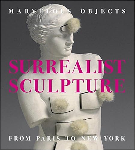
Marvelous Objects: Surrealist Sculpture from Paris to New York By Valerie J. Fletcher. (Prestel, 192 pages, 180 illus., $49.95.)


Inspired by dreams, chance encounters and wild, imaginative puns, surrealism aimed to go “beyond reason” into a realm of unbridled creativity. Its practitioners made strange objects such as Meret Oppenheim’s fur-lined teacup and Salvador Dali’s lobster-handled telephone. The movement’s paintings are better known than the fascinating objects found here, but they shouldn’t be.

This book presents an overview of the development of sculpture by artists who were inspired by the goals and methods of Surrealism. Surrealist Sculpture delineates a dialogue between the two dominant modes of sculpture that evolved in tandem within the Surrealist movement: found-object assemblages and nature-inspired biomorphism. The book offers a continuous narrative of contributions by both European and American Surrealist artists from the early 1920s through the early 1950s.Artists from France, Germany, Britain, Spain, Switzerland, and the United States established Surrealism as transnational from the outset. Key artists who incorporated found objects in their works include Marcel Duchamp, Man Ray, Salvador Dalí, Hans Bellmer, and Joseph Cornell. The biomorphists encompass Jean Arp, Max Ernst, Henry Moore, and Isamu Noguchi. In addition, Alberto Giacometti, Alexander Calder, and David Smith are highlighted for their game-changing innovations that influenced the evolution of modern sculpture. Nearly two hundred illustrations and a selection of historical texts accompany the insightful essay and chronology by Valerie Fletcher. Fans of Surrealism and those new to the genre will appreciate this book’s in-depth approach to its innovative and influential three-dimensional masterpieces.

John Lockwood Kipling: Arts and Crafts in the Punjab and London Hardcover – March 14, 2017 by Julius Bryant (Editor, Contributor),‎ Susan Weber (Editor, Contributor),‎ Catherine Arburthnott (Contributor),‎ Barbara Bryant (Contributor),‎ Peter H. Hoffenberg (Contributor),‎ Elizabeth James (Contributor),‎ Sandra Kemp (Contributor),‎ Nadhra Shahbaz Khan (Contributor),‎ Christopher Marsden (Contributor),‎ Abigail McGowan (Contributor),‎ Deborah Swallow (Contributor) (YAle University Press) (IBRArtBooks)


Founded in 1993 and operating out of two townhouses on New York’s Upper West Side, Bard Graduate Center has produced an admirable series of exhibitions and scholarly catalogs on subjects in its fields of study: decorative arts, design history, and material culture. Its monographic shows have focused on such figures as William Kent, the architect and pioneer of the English landscape garden; Thomas Hope, the collector of antiquities and definer of Regency design; and Charles Percier, Hope’s equivalent in France, inventor of the Empire style and codesigner of the rue de Rivoli. The catalogs of such exhibitions form an impressive, coherent group—an accumulation of expertise.

Among the surprises sprung by the center was a charming small display in 2013–2014 recording a period in which, while the French textile industry ground to a halt during World War I, an attempt was made in New York to create a new American decorative art not beholden to Europe, using the design language of pre-Columbian America and other “primitive” cultures. To this end, the American Museum of Natural History encouraged fashion designers to study and copy textiles and garments from its extensive holdings, and amateur models were photographed wearing original items from the collections: a Sioux dress with a beaded yoke; a Tungus Siberian reindeer fur and sinew coat; an Ainu bark fiber robe.1 Doubtless no great harm was done to the textiles in question. One presumes, however, that today such a use of a museum’s materials—using the museum like a dressing-up closet—would be absolutely taboo.


Kipling Papers–Wimpole Archive, University of Sussex Special Collections at The Keep
Rudolf Swoboda: Sketch of John Lockwood Kipling and sketches of Rudyard Kipling, circa 1887–1888


And not only taboo. The promotion of industrial art and design must rank low on the list of ways a modern anthropological museum wishes to engage with the world. Not so in 1919. Then the AMNH and the Brooklyn Museum joined forces for an exhibition of industrial art that showed what modern looms could produce when inspired by primitive looms and preindustrial design: the taupe silk charmeuse teagown with Bukharan motifs and the Sunset Fan-Ta-Si silk dress with blue duvetyn appliqué based on a Nanai fish-skin coat were among the proposals of the wartime ethnic look. “LADY or SQUAW,” declared an advertisement in Women’s Wear, “She Obeys the Impulse to DRESS UP.”

This concern of cultural institutions to direct and enrich the course of modern manufacture may be traced back to London, to the Great Exhibition of 1851 and the founding of what later became the Victoria and Albert Museum. Many imitations of the V&A sprang up around the world, including the Metropolitan Museum in New York, which once used to look much more like a museum of manufacture, a look it progressively shed during the last century.

When J. Pierpont Morgan and his son purchased the Hoentschel Collection and donated it to the Met, starting in 1906, one of their major purposes was to make available to the public fine and authentic examples of French decorative art from its greatest period. Georges Hoentschel had run a highly superior business in architectural salvage in Paris, and his collection was a compendium of the best paneling, furniture, frames, and metalwork from the period of Louis XIV to Louis XVI. The idea was that if you wanted to know how the doors in your apartment should look—what kinds of hinges and locks, what kinds of keyhole escutcheons—you could go to the Met, or send your man there, find what you needed, and have it copied. And thus taste would be elevated throughout the city, throughout the country.

To an extent, it worked. Here is Elsie de Wolfe, the pioneering interior decorator, in The House in Good Taste (1913):

The workers of today have their eyes opened. They have no excuse for producing unworthy things, when the greatest private collections are loaned or given outright to the museums. The new wing of the Metropolitan Museum in New York houses several fine old collections of furniture, the Hoentschel collection…having been given to the people of New York by Mr. Pierpont Morgan.

In due course, as modernism increasingly prevailed in the world of interior design, this aspect of the Met’s mission was forgotten, and the Hoentschel collection went into storage. There followed what have been called the Wrightsman years, in which the emphasis of the Met’s displays shifted to flawlessly realized and furnished interiors—complete rooms. Never has the ancien régime looked better, and cleaner, than it does in the crepuscular gloom of the Wrightsman Galleries, whose great strength is in the conveying of an Authentic General Effect. One is of course at liberty to peer at the details of carving, gilding, weaving, and chasing. But that is not the main point.

In 2013 the Bard Graduate Center was able to borrow items from the Hoentschel Collection in order to mount a revealing exhibition (with the usual outstanding catalog) about Hoentschel as a designer and collector and, it turned out, highly original ceramicist.2 What one saw was a different kind of authenticity—analytic, fragmentary, a past glimpsed through orphaned objects and unrestored surfaces. God, or the Devil, is in such details, and the details—the faucets and finials, the chair legs and newel posts—are now back in storage.

The center’s most recent show reprised the theme of the museum in relation to industry and craft. This time the subject was India, and the monographic focus was on John Lockwood Kipling, the father of the poet Rudyard. He was an artist and illustrator, a sculptor, a designer, a teacher, a museum curator, and, like his son, a journalist. The catalog is the result of an editorial collaboration between Julius Bryant of the V&A and Susan Weber, the founder and director of the Bard Center. Taken together, the various essays make an unanswerable case for the interest in Kipling’s father, a figure we might never have thought about before, unless we knew him as the original illustrator of TheJungle Book or of Kim, or unless, reading Rudyard Kipling’s unbearably sad autobiographical short story “Baa Baa, Black Sheep,” we had wondered about the parents who abandon their infant boy and girl, brought up in Bombay, to a foster home in England—weeping and choking as they do. One might think that the accusation leveled by the son (you put us through this torture) might be too much for a father to bear.

It turns out, though, that Lockwood and Rudyard in later life became the best of friends and collaborators. The father must in some way have accepted the justice of the rebuke contained in the story’s last paragraph: “For when young lips have drunk deep of the bitter waters of Hate, Suspicion, and Despair, all the Love in the world will not wholly take away that knowledge; though it may turn darkened eyes for a while to the light, and teach Faith where no Faith was.”

Father and son, however, not only hit it off. They worked together, discussing Kim, for instance, as it was being written. And indeed the first chapter of Kim features a portrait of Lockwood Kipling, in the form of the white-bearded curator of the Lahore Museum—the “Wonder House,” as the book has it—who receives the Tibetan lama in his office and shows him photographs of the very lamasery he has come from.

Everything in that opening chapter is extraordinarily specific. Rudyard makes it clear that the pilgrimage on which the lama and Kim embark has its beginning in (though he does not use the term) the Gandharan sculpture section of the Lahore Museum among “the larger figures of the Greco-Buddhist sculptures done, savants know how long since, by forgotten workmen whose hands were feeling, and not unskillfully, for the mysteriously transmitted Grecian touch.” There is much detail about Buddhist scripture as it is illustrated in Gandharan relief—so much, indeed, that Lockwood anticipated that Kim would prove difficult for the uninitiated reader. But he thought that was as it should be. There is a respect here for Indian art and philosophy that was far from common among the British at the time.
2.

The story of the British encounter with Indian art and architecture is full of surprises. For instance, it was discovered not so long ago that the playwright and architect (of Blenheim Palace and Castle Howard) Sir John Vanbrugh spent a part of the 1680s (his “missing years”) in Surat, Gujarat, working for the East India Company, where he is said to have been influenced by the architecture of the local cemeteries.

National Trust, Bateman’s/John Hammond
John Lockwood Kipling: Toomai of the Elephants, circa 1897

Thomas Babington Macaulay, the historian, went to India in the 1830s to write the Indian Penal Code, but found time to begin the Lays of Ancient Rome (one of the most popular volumes of English poetry ever) in the hill station of Ootacamund. Macaulay looked at the old forts of India and was reminded of Oxford—some of the shabbier colleges, he says. He looked at the rural architecture around Madras and was reminded of the small town of Llanrwst in North Wales (a more difficult comparison to grasp). “There are some signs,” he adds, “that the people in these huts have more than the mere necessaries of life. The timber over the door is generally carved, and sometimes with a taste and skill that reminded me of the wood-work of some of our fine Gothic Chapels and Cathedrals.”

About the villas of Europeans in India, Macaulay makes a pregnant observation:


They are large and sometimes very shewy. But you may see at a glance that they are the residences of people who do not mean to leave them to their children or even to end their own days in them. There is a want of repair—a slovenliness…which marks that the rulers of India are pilgrims and sojourners in the land. You will see a fine portico spoiled by a crack in the plaister which a few rupees would set to rights—gaps in hedges—breaches in the walls—door off the hinges, and so on. As no Englishman means to die in India…nobody pays the attention to his dwelling which he would pay to a family house. It is curious that the neatest and most carefully kept houses which I have observed are those of half-casts and Armenians, who mean to end their days here.

If it was true that no Englishman—as an individual—meant to die in India (Macaulay himself got out the moment he had finished the Penal Code), the British as a nation were determined to hold on to the subcontinent at all costs—something they demonstrated not only by their thorough and bloody suppression of the Uprising or Revolt of 1857–1858 but also by the complete reorganization of the Indian government in its relation to the Crown.

The shock delivered by the Indian Mutiny (as the British dubbed it) can be sensed in the opening pages of the first lecture in John Ruskin’s The Two Paths, which he delivered at the V&A in 1858–1859, and which Lockwood Kipling would have either heard at the time or read shortly afterward. Ruskin asks his audience how it comes about that a land devoid of visual arts, such as the Scottish Highlands, can produce people of exemplary virtue, while a country notable for its love of subtle ornament and design, India, goes in the opposite direction. He is thinking of the gratitude the British owe to the Scottish regiments in their


victories in the Crimea, and your avenging in the Indies…. Out of the peat cottage come faith, courage, self-sacrifice, purity, and piety, and whatever else is fruitful in the work of Heaven; out of the ivory palace come treachery, cruelty, cowardice, idolatry, bestiality—whatever else is fruitful in the work of Hell.

The degradation of the Indian mutineers has no precedent: “Since the race of man began its course of sin on this earth, nothing has ever been done by it so significative of all bestial and lower than bestial degradation, as the acts of the Indian race in the year that has just passed by.”

Ruskin asked himself how to explain the mismatch between this love of art and this Indian bestiality:


It is quite true that the art of India is delicate and refined. But it has one curious character distinguishing it from all other art of equal merit in design—it never represents a natural fact. It either forms its compositions out of meaningless fragments of colour and flowings of line; or if it represents any living creature, it represents that creature under distorted and monstrous form. To all facts and forms of nature it wilfully and resolutely opposes itself; it will not draw a man, but an eight-armed monster; it will not draw a flower, but only a spiral or a zigzag.

And so the Indians are cut off from all healthy knowledge and natural delight.

Aside from the notable ignorance of Ruskin’s remarks, there is a strain of madness or hysteria here. The decorative arts of India had long been known and valued in the West. It seems that Indian fine arts, by contrast, were slow to receive appreciation. Gandharan sculpture, in the Greco-Buddhist tradition, was one thing. But the art of the Hindu tradition—the great sandstone temple reliefs, architectural elements, and the statues of the gods—probably more than anything else inspired a kind of horror in those who cared to look at them. They were idolatrous. They were also often obscene. Sir George Birdwood, the “Art Referee for the Indian Section of the South Kensington Museum” (renamed the Victoria and Albert in 1899), wrote as late as 1880 that “the monstrous shapes of the Puranic [that is, Hindu] deities are unsuitable for the higher forms of artistic representation; and this is possibly why sculpture and painting are unknown, as fine arts, in India.”

Lockwood Kipling, born in 1837 into a Methodist family in the North of England, was inspired by a visit to the Great Exhibition of 1851 to become an artist and a craftsman. He served an apprenticeship with a ceramics manufacturer, Pinder, Bourne and Hope—not exactly a household name, and not, one might have thought, in smoke-blackened Stoke-on-Trent, a promising start to an artistic career. Intriguingly, though, Kipling was taught at the Potteries School of Art by, among others, the French sculptor Albert Carrier-Belleuse, who specialized in architectural sculpture (at the Paris Opera and the Louvre, for instance) and who later employed Rodin as his assistant. Carrier-Belleuse was at that time in England working for Mintons. Later he became head of the Sèvres manufactury and took Rodin with him. So Lockwood Kipling’s start in life was not so odd for an aspiring artist.

Architectural sculpture, ceramic and stone reliefs, and all kinds of ornamental work were required on the grand public buildings that were going up in Britain and in the British Empire: Gothic buildings, French and Italian renaissance buildings, buildings of a strange, exuberant eclecticism, with Venetian façades and metal structures resembling tram sheds or railway stations. One such was the South Kensington Museum itself. As recently as 1982, when John Physick wrote his history of the museum’s building, no one could explain why Lockwood’s portrait, in mosaic, is included on the original front entrance in a procession of dignitaries. The answer is that Kipling had helped Godfrey Sykes model most of the terra-cotta decoration of the exterior, but that somehow it had slipped from the record.

Kipling and his wife, Alice, were both of Methodist stock, and both came to reject the religion of their upbringing—Alice with a memorable gesture. She was a teenager when, family legend had it, she came upon a lock of John Wesley’s hair—a pious souvenir of the great preacher. This she “triumphantly” threw in the fire, with the gaily offensive words: “See! a hair of the dog that bit us.” She was “artistic” (a term then used for women who dressed somewhat unconventionally) and related by marriage to Edward Burne-Jones and to another painter less well known today but in his time highly successful, Edward Poynter. She wrote, but only pseudonymously. She seems to have been ambitious, like her husband, and going to India, as a young pregnant wife, was perhaps a sign of that ambition. But in Bombay and Lahore she was definitely restricted in what she might actually do. She was witty and on occasion referred to as sour. Those who liked the Kiplings seem to have liked them a great deal. Others found something unpleasant in their company—something no doubt to do with the frustrations of class.

In India, when the Kiplings arrived in 1865, the buildings that had once struck Macaulay as being so ill-kept had been mostly Palladian in design. But after the Revolt of 1857 the new style for the public buildings in Bombay was Gothic, and the Bard catalog tells us that “still, today, Mumbai can boast the world’s finest assembly of Victorian Gothic architecture, much of it encrusted with sculpture modeled and carved by Kipling and his pupils.”

Lockwood and Alice had come to take advantage of the boom city. Bombay in the 1860s profited from the blockade of the American South and was growing rich through the export of Indian cotton to the Lancashire mills, as well as Indian opium to China. The couple began their Bombay residence in tents on the Esplanade, and Lockwood taught sculpture in a temporary shed nearby, while the place of his employment, the Sir Jamsetjee Jeejeebhoy School of Art and Industry, was being designed (back in England) by the notable medieval-minded architect William Burges.

Kipling was critical of what had passed for architecture in British India:

The architecture imported by the English has…done more grievous injury than can be estimated with calmness. Barracks, churches, and houses, designed for the most part by people who have had no education in architecture of any kind, but who are at best fair engineers, are looked on by natives as authoritative examples, and their blank ugliness is copied with exasperating fidelity…. There are many who think that when they have reared a clock tower in nineteenth-century British Gothic in the centre of a native city they have taken a serious step in the march of civilisation.

This might be read as a barb aimed at many a Bombay project, including several to which Lockwood had himself contributed (such as the market fountain in Bombay closely modeled on one designed by Burges for the city of Gloucester). By contrast, when in due course Lockwood moved on to Lahore to head an art school and museum there, he sought to pioneer a style based on local traditions. One of his chief concerns was the preservation or revival of Indian artistic practices. “It is on the architecture of today,” he argued, “that the preservation of Indian art in any semblance of healthy life now hinges.” To this end he not only collected Indian arts and crafts. He also drew charming studies of craftsmen at work. One feature of the Lahore museum that caused great interest among visitors was a series of small models of such craftsmen, accurate in all details of their trade. Lockwood was concerned to find markets for Indian work, and made sure that it was represented in the kind of international fair that had sprung up after the model of the Great Exhibition of 1851.

Had he not devoted so much time to this educational and administrative work, he could easily have made a living as a sculptor. He had a particular gift for working in relief (the catalog suggests that was influenced by the Donatellos at the V&A), and sought new ways of using it. So the illustrations to Kim were modeled in plaster relief and then photographed—an original combination of media.

It is astonishing to me how much has been retrieved by the scholars involved in this enterprise. As the Raj recedes it loses perhaps just a little of its toxicity. It has become possible to take a closer look at Rudyard Kipling, and that closer look often includes Lockwood Kipling in the frame. Then the father becomes interesting for his own sake—something the son would never, it seems, have resented. One cannot help wondering how many comparable figures are waiting for such an unexpected revival.