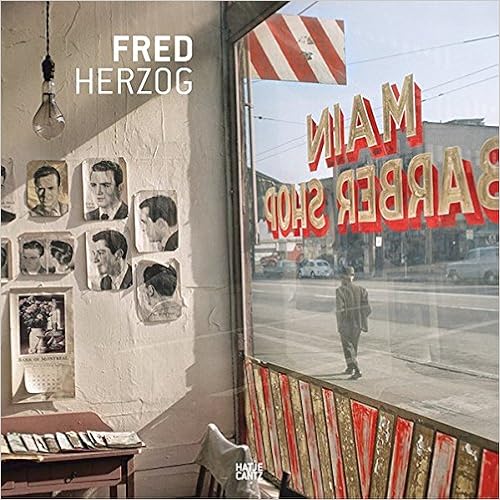
I reviewed the first Hatje Cantz book on Herzog published in 2011 and I said it was a shame the book wasn't bigger, this gorgeous, large book of his photos solves that problem.
THis is the most comprehensive book yet published on the Canadian color-photography pioneer Fred Herzog is best known for his unusual use of color photography in the 1950s and 1960s, a time when art photography was almost exclusively associated with black-and-white imagery. In this respect, his photographs can be seen as prefiguring the New Color photographers of the 1970s. The Canadian photographer worked largely with Kodachrome slide film for over 50 years, and only in the past decade has technology allowed him to make archival pigment prints that match the exceptional color and intensity of the Kodachrome slide, making this an excellent time to reevaluate and reexamine his work.
This book brings together over 230 images, many never before reproduced, and features essays by acclaimed authors David Campany, Hans-Michael Koetzle and artist Jeff Wall. Fred Herzog is the most comprehensive publication on this important photographer to date.
It's the color in these photos that fascinated me. Herzog used Kodachrome slide film and the colors have a warmth and maturity that definitely adds to their beauty, especially the incredibly vibrant reds and oranges. The only other photo book I've seen with pictures from the past, that has this richness of color is 'Bound for Glory: America in Color 1939-43' with images from the well known FSA/OWI photographers.
Herzog was experimenting with color long before it became accepted, in the mid-seventies, as a serious photographic form. The Vancouver color photos are all street scenes showing everyday life with traffic, shoppers, sides of buildings, and lots of signs. He says that the work of Walker Evans influenced him especially the 'American photographs' book and of course Robert Frank. There are many shots that are saturated with signage typography and Vancouver did a nice line in gigantic upright neon signs spelling out the name of movie houses, a sort of electronic DayGlo.
I believe the 230 photos includes the ninety-two in the 2011 book and there are some black and whites also. David Campany makes an interesting point in his essay: 'With great consistency he averaged two films a week. That amounts to well over 100,000 exposures'. I'm hoping that means more books of Herzog's photos. My only very minor criticism is that I would have preferred to have all the Vancouver shots as one chapter and the work from other cities and countries as another.
I think it's worth commenting on how inexpensive this thick book is, printed on a good matt art with a 175 screen, from other art book publishers it would cost a lot more, even at full price it's a bargain.


No comments:
Post a Comment